Hmmm, something’s different…
I’ve recently updated the fonts on this entire website. Fonts are really important to all of us, especially programmers who stare at a text editor all day. I’m hoping this new refresh will enhance legibility as well as make the viewing experience more fun. One of the first things you’ve probably observed as you’ve navigated around my site, is the total (and possibly suspicious) lack of serifs.
Now this is on purpose, personally, I find serifs difficult to look at and it makes my reading experience worse. I remember writing essays in high school where the teachers required Times New Roman (probably one of the most famous serifed fonts). I would write the whole paper in a readable, approachable, sans serif (sans is french for without) font and then right before submission, ctrl+a and change the font to Times New Roman. You may think this extreme, but it was THAT uncomfortable for me to read.
Fonts for programmers
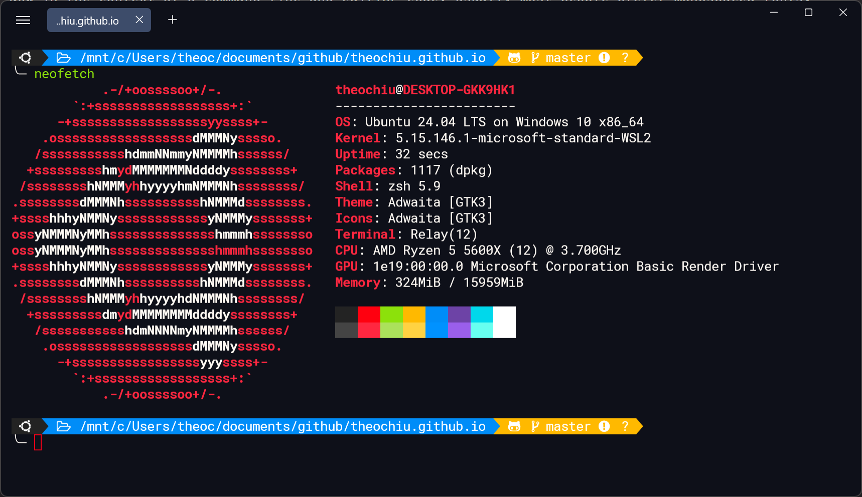
For context, and for those who might be unfamiliar, most programmers have customized text editors and IDE’s as well as super custom terminals themed around fonts. Now in the context of a command line and editing code, usually most people prefer monospaced fonts. Pictured below is an example of my ZSH config inside WSL2.
 output of neofetch command
Here you can see the font includes nice icons. From left to right: ubuntu logo (operating system), folder icon (to denote the path), octocat icon (to denote a github repository), a branching icon (to denote the branch we’re on), and then the yellow color, to show that we have changes not staged nor committed (disclaimer: I promise I commit frequently, I took this screenshot mid blog post drafting, so those are the non staged and non committed changes). These icons are a part of the fonts found in nerdfonts. Specifically, the font pictured is Hack Nerd Font (download can be found in previous link).
Editors and IDE’s
For viewing and editing code, my font of choice is Fira Code. My love for this font can be summed up in one word: Ligatures. Consider this following function in the DMA submodule in the linux kernel
static gfp_t dma_direct_optimal_gfp_mask(struct device *dev, u64 *phys_limit)
{
    u64 dma_limit = min_not_zero(
        dev->coherent_dma_mask,
        dev->bus_dma_limit);

    /*
     * Optimistically try the zone that the physical address mask falls
     * into first.  If that returns memory that isn't actually addressable
     * we will fallback to the next lower zone and try again.
     *
     * Note that GFP_DMA32 and GFP_DMA are no ops without the corresponding
     * zones.
     */
    *phys_limit = dma_to_phys(dev, dma_limit);
    if (*phys_limit <= DMA_BIT_MASK(zone_dma_bits))
        return GFP_DMA;
    if (*phys_limit <= DMA_BIT_MASK(32))
        return GFP_DMA32;
    return 0;
}
Note that this website uses Fira Code in syntax highlighting blocks (such as the one above). See how the “->” symbol renders to a nice coherent arrow without the awkward gap. In the same way, the characters “<=” renders to less than or equal to with the line underneath the lesser than sign. These ligatures make reading and writing code much, much more legible. Many symbols like this used in programming languages are trying to use the normal English keyboard to capture a notion of a symbol that just wasn’t common on typewriters at the time (and arguably aren’t today either).
For example the arrow operator denoting pointer access was trying to get to the notion of an arrow. However most keyboards don’t have a dedicated “arrow” button (I say most because I’m sure there has got to be someone with a custom keyboard with a custom arrow button). Because of this programmers settled for using dash greater than, even though the operator itself is commonly referred to as the “arrow operator”.
When parsing or writing huge amounts of code these visual “nice to haves” start to become significant as they cause less eye wear and mental fatigue, I always recommend finding a comfortable font for any programmer setting up their environment.
Blogs
For blogs, design has always been an important part of the game. Gone are the days of bare html blogs with just functional text. Modern blogs feature responsive design and most are even mobile first. Fonts are an easy way to level up our communication with others. They are an easy way to set yourself apart from everyone else. All operating systems and devices have a default font. To use a font that is custom to you, one that you have searched out that you personally find visually pleasing is a unique thing that will always distinguish you from others.
Don’t settle for visual mediocrity, research and find a font for yourself today!